 I met Adele one fall day. I had always liked her type—beautiful lines, bookish, a hard worker. She wore her refurbished belt with style. Adele had a past and was a little out of my league. I was inexperienced, but intrigued—smitten with the possibilities.
I have seen enough to know a relationship can’t be all fun, so I knew we had work ahead of us. We needed to get to know each others’ quirks and whims. Any partnership requires patience and an intimate knowledge of one another. I could have forced things. She had buttons to push. But where would that get us? We had to take our time and learn from one another.
But Adele already had someone in her life—someone who knew her intimately. I noticed that Adele could be difficult, tempestuous and downright stubborn. Yet her partner accepted her foibles and even celebrated them. They had seen one another’s dark sides.
We ran into some tricky spots early. First, a “y” wasn’t taking ink. A few prints later we noticed a period had vanished.
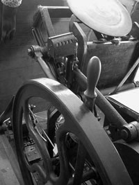
photo courtesy of Bremelo Press
“She doesn’t really get going until the fifth or sixth pull,” Lynda said as if Adele were a crotchety aunt who needed a bourbon to get to the good jokes.
Lynda Sherman is a master printer and artist—that someone special in Adele’s life.
Adele is an 8″ x 12″ Chandler & Price jobbing press, manufactured in Cleveland, in 1906, who now lives in a building on the corner Rainier Ave. S. and South Jackson Place in the Little Saigon neighborhood of Seattle.
“She’s a spry 106 years old,” Sherman added.
My wife had given me a printing class at Bremelo Press for my birthday, knowing my penchant for anything letterpress. Sherman offers a printing class that promises to leave you with working knowledge of the Fibonacci Number Series, the terms of fine hand-set letterpress “and a product of which to be proud.”
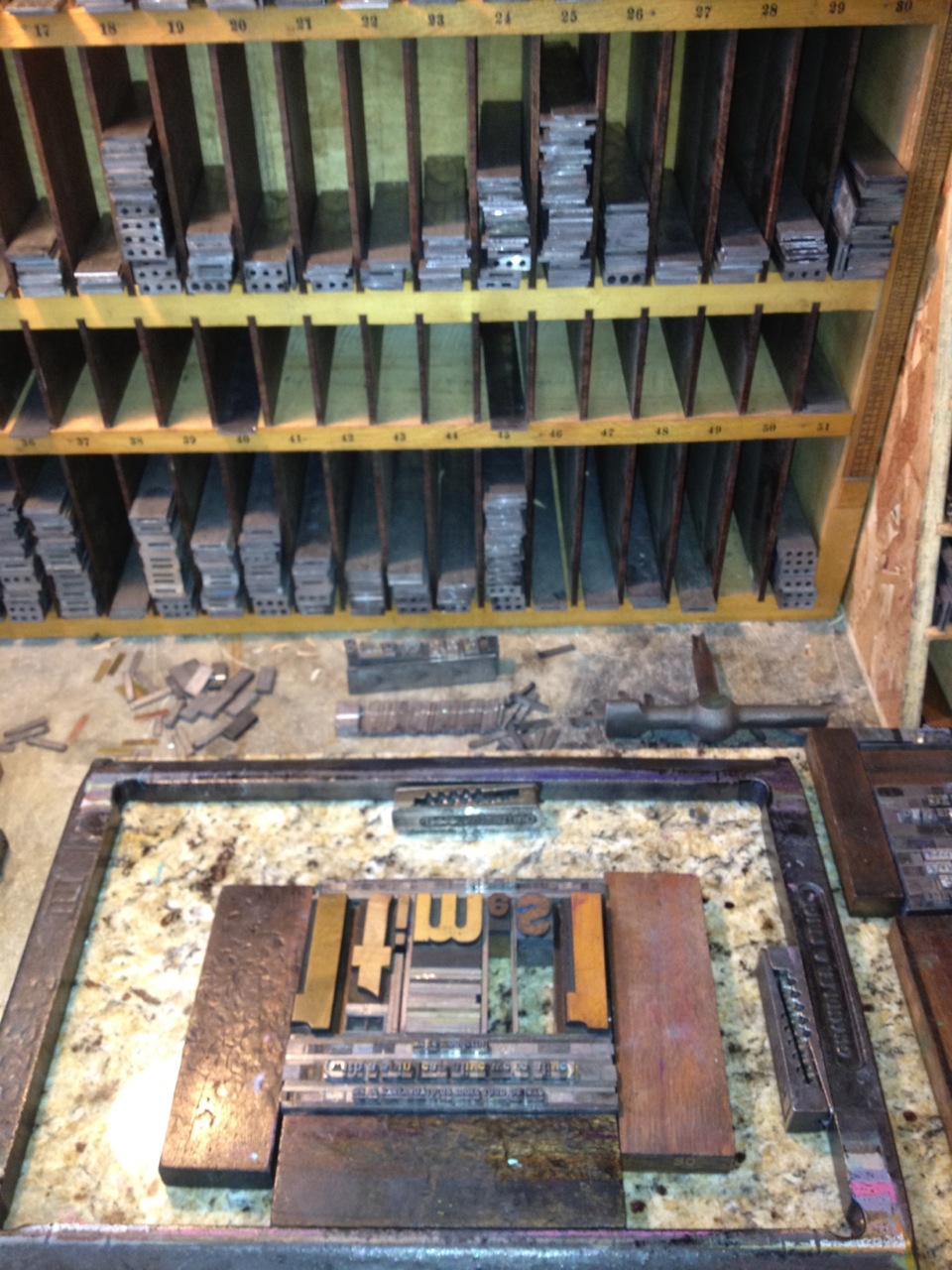 Previous to the print run we pulled the tiny metal letters, or “sorts,” of our chosen Caslon typeface. We placed the sorts into the composing stick, or “job stick.” All words must read left to right as normal, but the letters appear backwards and upside down (“Be mindful of the ‘type demons’ b,d,p, & q,” Sherman says). Once a line read correctly (though that was anyone’s guess) we “dumped the stick,” and used a key to tighten down the “quoins”—ingenious little simple machines that secured the set type into the “chase.” The chase is a rack that holds the type in place for printing. Then we chose the ink color, dabbed some on the disc, and readied the stack of paper. We were ready to go to press.
As imperfections came up over the next half hour, Sherman used adjustments from her bevy of fixes. To push out the “y,” she carefully placed tiny pieces of Scotch tape on the back of them, which worked, but two other letters were then embedded too deeply into the cotton paper. They stood bolder than all the 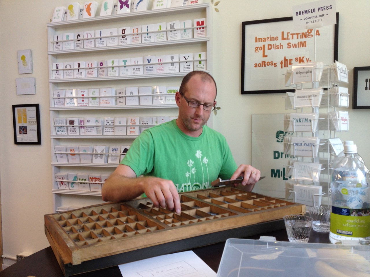 others as if they wanted to get noticed. Sherman pulled out the entire chase to tap all the type flat with her wooden mallet.
A few more prints into the run, we discovered a new mistake—a giant, wooden numeral “1” listing to the right. Lynda removed a few spacers—tiny coppers—that had fallen behind the type, which fixed the problem. At another point the disc needed more red ink as the lettering began to get spotty (“salty” in printer parlance)—the preferred choice for some projects.
After numerous modification, things settled into a rhythm and we printed thirty of our chosen 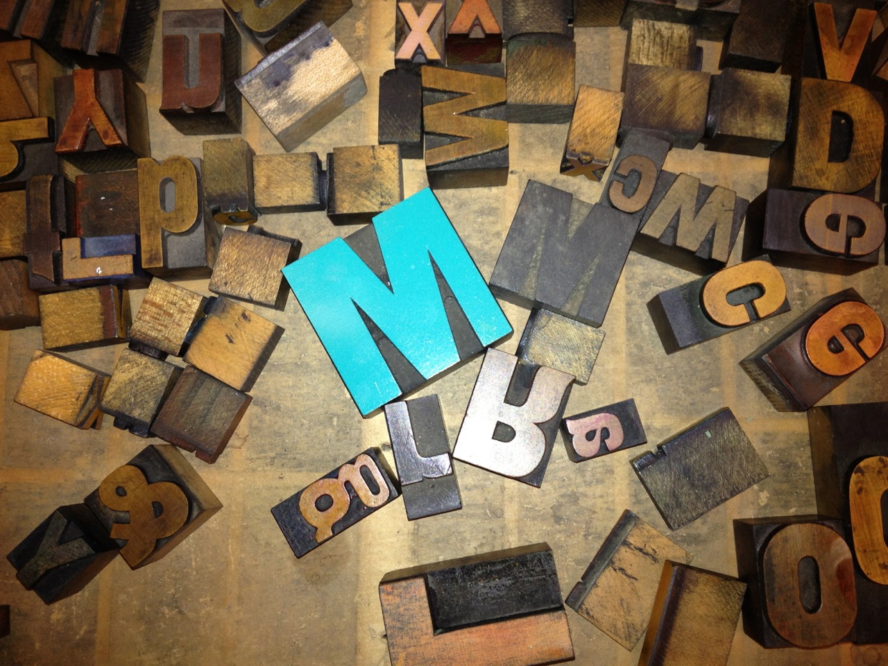 lines from an e.e. cummings poem onto thick, fibrous cotton paper.
What struck me was that Sherman viewed, or seemed to view, each printing interruption with patience and grace—her thousands of repetitions all adding to her poetry of motion. Each mistake was an opportunity for her to work in conjunction with her old friend, every fix a move toward elusive perfection. I pictured the tantrums they each had certainly had within the studio walls. But in the moments I witnessed Sherman added ink, replaced the period and removed the copper spacer—nudging and cajoling Adele all the while. Then she started the run again, hand-placing each blank card carefully for its own fresh imprint of our chosen poem excerpt.
 In any craft, writing included, the initial idea—the gem—is always exciting. You fall in love a little. But then comes the work. There will always be a “y” that isn’t quite right, a period that disappears. Hours of work lay ahead, perhaps years.
Kevin, the man who owned the press before Sherman, named it after Fred Astaire's first dancing partner, his sister Adele. Kevin believed that printing was like a dance.
“It requires a quick and delicate partnership,” Sherman says.
Our piece of poem is now sitting on our living room mantel. When I look at it or hand one to a friend, I see the words, but I also see our time spent setting the type, fixing the mistakes and pulling the hand-worn lever over and over. I see my dance with Adele.

Bremelo Press's Lynda Sherman
Other things learned from Sherman at the Bremelo Press printing class:
• The terms “upper case” and “lower case” come from where the cases of letters were placed as the typesetter pulled letters (or “sorts”) to set the lines of type.
• J and H were added to the alphabet later on so their spots in the case were toward the bottom right out of any recognizable order.
• The “Maker’s Mark” is the manufacturer of the type’s name and is always shown on the capital “A” of the wood type.
• “Cut to the chase,” meant to get the work to press. The chase is the rectangular-shaped metal that holds the type in place when it’s ready to put on the printer.
• The term “out of sorts” refers to when a typesetter would run out of a certain letter, as each letter of type was called a “sort.”
• After an apprenticeship with the legendary printer Dikko Faust in New York City, Sherman returned to Seattle and for more than ten years has worked under the imprint Bremelo Press.
Mark Holtzen grew up in the Pacific Northwest. He teaches, reads, bike commutes and writes in and around Seattle. His children's book, The Pig War, was selected for Kirkus' Best of Indie 2012 and is available at many indie bookstores in the NW. Check here for a list.


Thank you, for this! And kisses to Adele.
Sweet and well deserved praise for a brilliant piece of technology from the past. My Cannon ink jet printer can only dream of such artful adoration.